Description of the limitation and why it is relevant to address
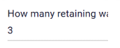
It is hard to manage users who have different screen resolutions.In my testing, this parameter was fully readable, but for users with smaller screens the parameter text is cut short as seen in the image below.
I use the flex argument but the layout will be modified when comparing smaller screens with larger screens if there are too many items before the LineBreak(). This will look bad when trying to group certain parameters or fields together on the VIKTOR app.
Submitter proposed design (optional)
If the ui_name text is too long, continue on the next line instead of cutting off the text.
Current workarounds
Using flex argument, but not ideal when trying to manage different screen resolutions.
Hi @PanjiBrotoisworo,
thanks for the suggestion! I understand your point. The problem with extending the name to a new line, is that it leads to alignment issues with other fields in that line.
Did you know that if you hover on the name it shows the complete name? Does that help?
Yes, it works if we hover over the parameter. We can see the full name. However, in our experience this would confuse people, especially for our engineers who are not very comfortable with tech.
Hopefully you will be able to find a solution for the alignment issues with text wrapping.
1 Like
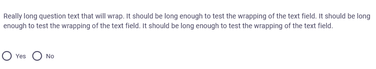
For now my solution is just to use a Text parameter before the question parameter.
In the code it looks like
question_text = Text("Really long text that will wrap")
question = OptionField("", options=["Yes", "No"])