In many cases, after a design process has been parameterized and automated, the next step would be find optimal solutions. When developing an optimization algorithm for a model, it sometimes feels impossible to get insight on how it reacts during that process of finding the optimal solution (and the big question whether you are actually getting optimal results).
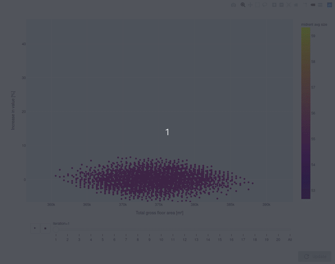
The visualization below is an example of a means of visualizing the optimization algorithm propogating results over time (iterations). In this example you can see how the optimization “finds its way” in the design space to an optimal solution, or multiple optimal solutions, depending on the user’s preference. This can be done by for example inspecting a summary of the data of a given design point.
The visualization presented below was done using plotly in the WebView.
#WebView #plotly