Description of the limitation and why it is relevant to address
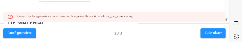
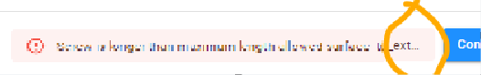
Our in-house packages include custom errors, such as the ‘UserError’ for the VIKTOR platform, which indicate to the user the relevant parameter changes required to proceed to the following steps. However, most of the time, the message is not completely visible at first sight.
I think this is relevant for the VIKTOR platform because …
Error messages for the user are important and should be viewed in their entirety.
Submitter proposed design (optional)
To allow more room for the message.
Current workarounds
The mouse must hover over the message for the complete text to be displayed. This requires additional actions from users of our apps, making it less intuitive for them to understand what went wrong.
Also, narrowing the browser leads to more available spaces :