Snippet Wednesday! - Add maps to your Automatic Reports πŸ—ΊοΈ

For this edition, I am building on @mslootweg 's snippet about adding plots to automatic reports by showing you how to add a map image!

Similarly to the snippet of Marcel, I will show you how to use plotly to turn a geojson file into a beautiful image.
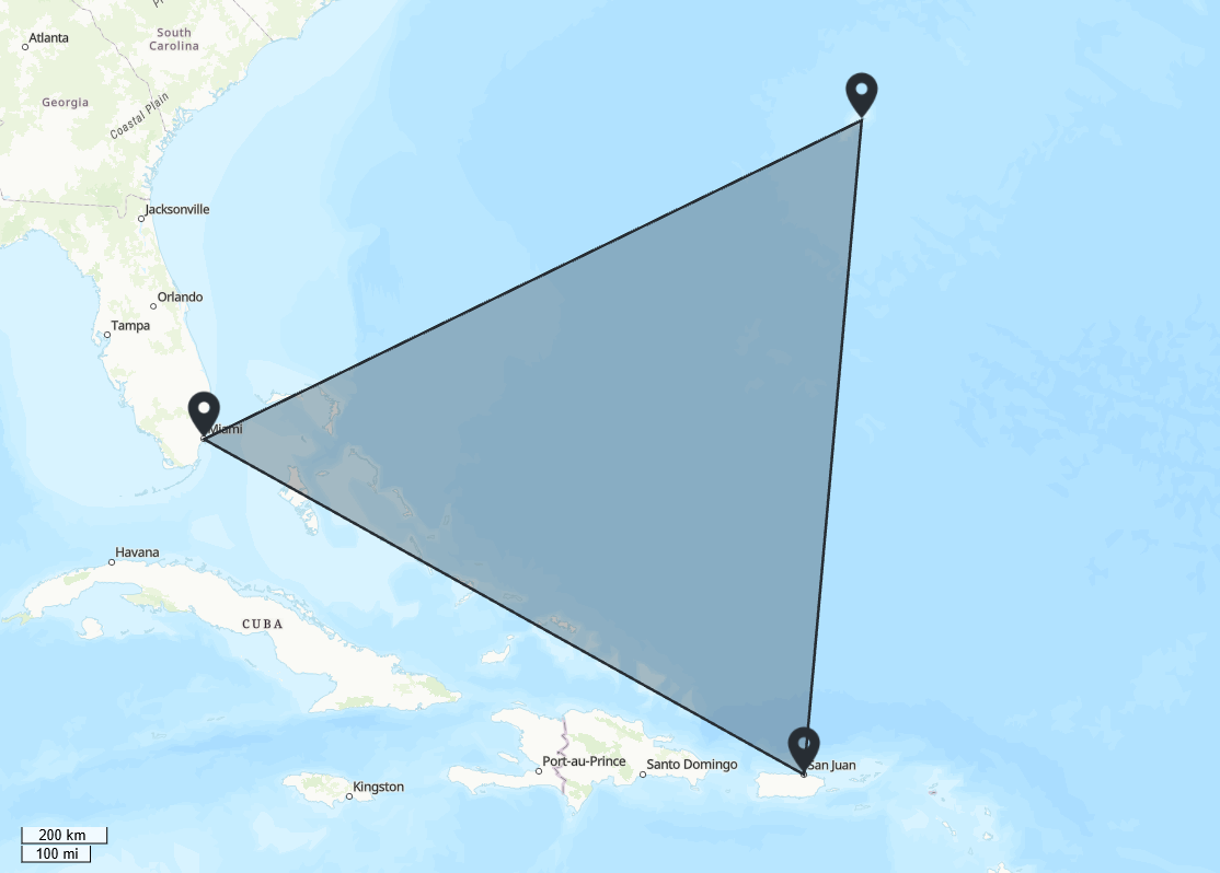
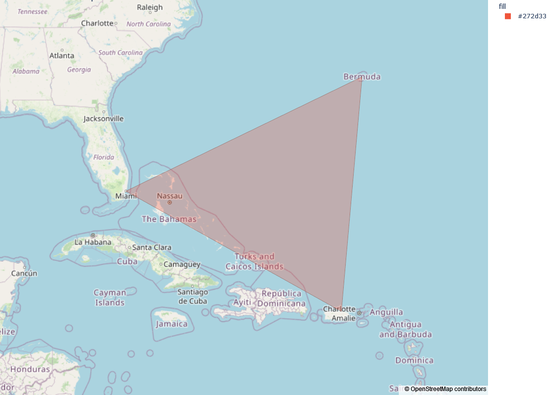
Since you already know how to add a plot as an image, I will just show you how to turn the geojson into an image; the rest of the process is the same :sunglasses:

The Snippet
you will need a suitable geojson file, for this example you can download one from the internet. Also, you will require and an extra package called geopandas, so make sure to add it to your requirements.
(note: you may need to make some changes to the code to accommodate for the geojson that you are using)

:point_down:Click here to see the code :point_down:


   def make_plotly_map(self, params, **kwargs):
        with open(Path(__file__).parent / "countries.geojson") as f:
            geojson = json.load(f)

        geo_df = gpd.GeoDataFrame.from_features(geojson["features"])
        fig = px.choropleth_mapbox(geo_df,
                           geojson=geo_df.geometry,
                           locations=geo_df.index,
                           color=geo_df.fill,
                           opacity=0.3,
                           color_discrete_map={'your country': viktor_green_hex,
                                               'VIKTOR country' : viktor_blue_hex,
                                               'Other': viktor_yellow_hex},
                            mapbox_style="open-street-map",
                            title="VIKTOR developers around the world",
                            zoom=0.1      
                           )
        fig.update_layout(margin={"r":0,"t":0,"l":0,"b":0})
 

        return fig


What does this look like?
The final result of your plotly map will look something like this. As you can see, I was able to change some colors on the map too.


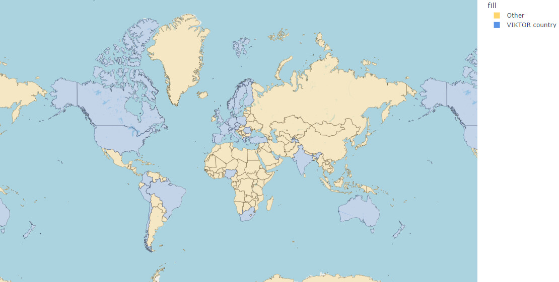
Some interesting things about this Choropleth plot is that you can choose between many map types, even satellite, and they are highly accurate. You can zoom in to streets and even see houses on most.
This does of course means that this map takes up quite a bit of memory so take care that you do not go over the limit!

I hope this snippet has inspired you and if you have any alternatives to making maps I am open for discussion on suggestions/feedback.

4 Likes

Nice post, @ThomasN !

To add to this, if you want to make an image of your MapView, you can extract the geojson from the MapResult. Here is a snippet of how you can set up your map view (taking the example provided in the documentation):

    def _get_map_view(self, params):
        # Create some points using coordinates
        markers = [
            MapPoint(25.7617, -80.1918, description='Miami'),
            MapPoint(18.4655, -66.1057, description='Puerto Rico'),
            MapPoint(32.3078, -64.7505, description='Bermudas')
        ]
        # Create a polygon
        polygon = MapPolygon(markers)

        # Visualize map
        features = markers + [polygon]
        return MapResult(features)

    @MapView('Map view', duration_guess=1)
    def get_map_view(self, params, **kwargs):
        return self._get_map_view(params)

Then, using the geojson property on the MapResult object, you can extract the geojson. Here is the snippet combining the code presented above:

    def make_plotly_map(self, params, **kwargs):
        geojson = self._get_map_view(params).geojson
        geo_df = gpd.GeoDataFrame.from_features(geojson["features"])
        # get average of bounds
        fig = px.choropleth_mapbox(geo_df,
                                   geojson=geo_df.geometry,
                                   locations=geo_df.index,
                                   color=geo_df.fill,
                                   opacity=0.3,
                                   mapbox_style="open-street-map",
                                   title="VIKTOR developers around the world",
                                   zoom=self._get_map_zoom(geo_df),
                                   center=self._get_map_center(geo_df),
                                   )
        fig.update_layout(margin={"r": 0, "t": 0, "l": 0, "b": 0})

        return fig

Notice that I’ve added methods to the zoom and center arguments. Here is the map center method:

    @staticmethod
    def _get_map_center(geo_dataframe):
        lat_min = geo_dataframe.bounds['miny'].min()
        lat_max = geo_dataframe.bounds['maxy'].max()
        lon_min = geo_dataframe.bounds['minx'].min()
        lon_max = geo_dataframe.bounds['maxx'].max()
        lat = (lat_min + lat_max) / 2
        lon = (lon_min + lon_max) / 2
        return {'lat': lat, 'lon': lon}

Basically, I’m taking the bounds of the geodataframe, and averaging them to get the center.

For the zoom, it was a bit more difficult, and definitely not accurate. For this I’ve applied my own crude algorithm (I recommend adjusting the constants if they do not fit the cases that you would apply it to):

    @staticmethod
    def _get_map_zoom(geo_dataframe):
        lat_min = geo_dataframe.bounds['miny'].min()
        lat_max = geo_dataframe.bounds['maxy'].max()
        lon_min = geo_dataframe.bounds['minx'].min()
        lon_max = geo_dataframe.bounds['maxx'].max()
        lat_diff = lat_max - lat_min
        lon_diff = lon_max - lon_min
        alpha = 20
        beta = 0.55
        # set up a simple algorithm based on two constants
        zoom = alpha / (max(lat_diff, lon_diff)) ** beta
        return zoom

I’ve only hacked this together quickly, and noticed that many things can be improved to making the maps similar. Hopefully we can get more developers onboard to get this snippet improved.

Here is my test case comparison:

MapView

Plotly image