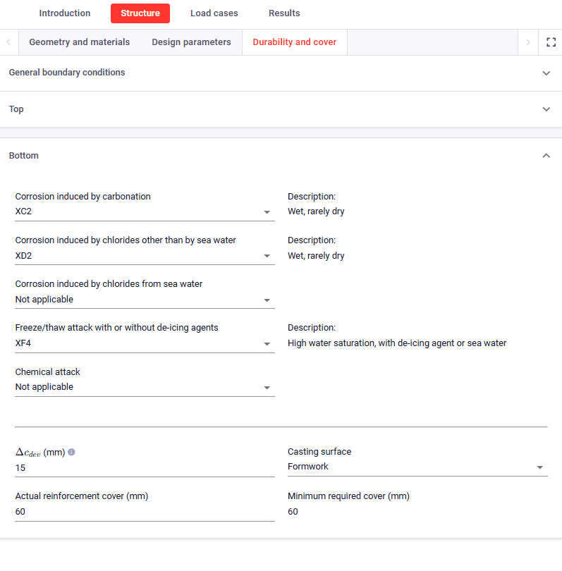
Thanks for the extra input wichard!
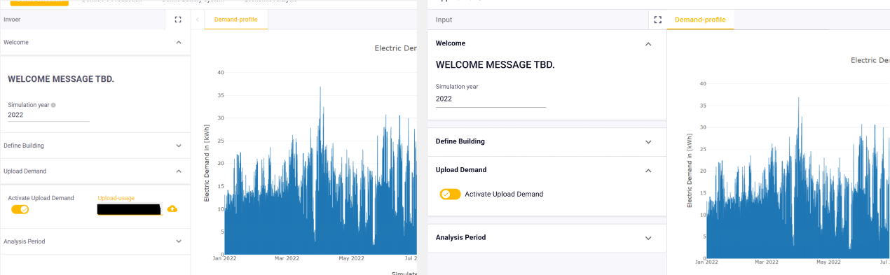
@Johan_Tuls @Wichard your feedback has inspired some further work on sections - to make them more distinguishable from regular text. Here is a side-by-side comparison of one of the explorations.
How well do you feel this solves sections being more distinguishable in the input panel?
@HEnino23 I have used your original screenshot as an example!  I’d be interested for your thoughts on this too if you have any.
1 Like
I think it is much clearer.
I like the space between sections and obviously the bold font.
Maybe it would be nice to allow custumizability of the size just like the Text() with #, ##, ### etc.
But this would probably make us use Sections (more) as we mainly avoud them due to the lack of visibility for the user.
1 Like
Thanks for the feedback @Johan_Tuls!
@HEnino23 @Wichard we have release an improvement on the sections by adding the section spacing and the bold font on sections.
1 Like