Description of the limitation and why it is relevant to address
As a deveIoper I want to be able to change the dashboard appearance of users so that the usage of an app worskspace is must clearer
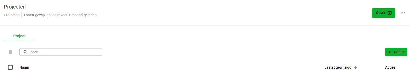
I think this is relevant for the VIKTOR platform because user are (in the beginning) confused that they have to open an entity in the panel at the left side. I believe this is not intuitive. The activity screen and group activity screen I believe is not the most important part the user wants to see.
It could be helpfull to control the tree of entities and force them to be unfolded. But I would prefer to have the entities on a more prominent place.
A request has been made by @Hassis93 to, when a tree-type application only has one root entity, to automatically bring the user into the editor, rather than having to click on the “Open” button of the root entity.
At the moment it does not give the best user experience when clicking to open the app, and then subsequently also needing to open to editor of the root entity.
This would also allow for developers to be more free in setting up a user interface of their preference, as the dashboard is very limited in the possibilities.
With the latest platform release and SDK 14.19.0 we have added the possibility of skipping the dashboard. User can be automatically forwarded into a specific entity. Curious to hear if you like it!
@mathijs it seems that if i set use_as_start_page=True it does skip the dashboard, but it doesn’t open the root entity. Instead if opens the “ChildEntityManager” showing only the children.
However as we make use of the ChildEntityManager the landingspage should be the editor of the entity that is used as start_page instead of browsing it.
The editor of the root entity is adjustable and could contain certain views, child entity manager etc. so the landing page could be personal for the app that is opened.
Hi @Johan_Tuls, my apologies for giving the wrong timeline for rolling out the bugfix to production. We just updated it. Could you check the newest release and see if it is fixed?