Description of the limitation and why it is relevant to address
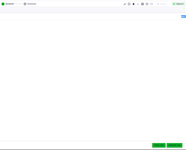
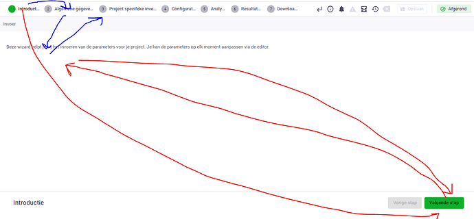
If i have to go to the next step I am forced to go to the bottom right, then go back to the upperleft corner to enter some parameters and go back to the bottom right.
I want to simply click on the next step (grey at that moment) instead of travelling all the way to the bottom right.
It is already possible to do so, if I go back, but forward is not possible.
Should be a simple and fast change, but it helps a lot for the user.
Current workarounds
Yup, travelling huge distances 
Hi Johan,
Thanks for posting.
Are you using any specific input validation?
In case you are not, can you explain why a Page layout would not be suitable? This would allow the user to navigate back and forth on the top of the window.
Hi Daniël,
It used to be Page, but it seems our Users appreciate the Step UI to step through the proces.
We always have a validatie layer in every end point. We do not activate it on “Next Step” as it is really slow. Instead we have views per Step that check the validity of the input.
Hi Johan,
To better understand your problem I have a few questions:
-
How many steps do you have? For me, when there is no input validation at all, but it almost instantaneous. It is not ideal, but in my case, I only have 4 steps, so it is not that many clicks.
-
As I understand it now, you are using the input validation on the views instead. Do you feel that the time for the input validation is less bothering on the view rather than on the steps? If yes, do you know why the users find it less bothering there?
-
Currently, the Steps are designed as a way for you as a developer to guide the user to do the steps in order, and not skip any. On the other hand, the pages are designed for apps where the user can navigate back and forth more freely. What part of the Steps UI do your users like that they are asking for it, even when navigating back and forth?
Thank you,
Paulien
Well, maybe it’s just me, but I meant the long distance/time required to proceed to the next step. The UI is okay; I just want to click on “Step 2” in the upper left corner instead of the bottom right for the next step. So my mouse would follow the blue path (my suggestion) instead of the red path (current situation). Alternatively, there could be a shortcut key, like the left/right arrow, to navigate between the steps.
As mentioned earlier, it’s more of a UX issue than a UI one. I simply have a strong dislike for web-based interfaces without shortcuts, where you have to travel a lot when it could be instantaneous.
Switched status to “in-progress”
@Johan_Tuls we have picked up the implementation!
1 Like
@Johan_Tuls : this has now been fixed 
I’m verry happy with this improvement, thanks for the push, hope you like it as well!
1 Like
For sure, it helps a lot ^^
1 Like
![]()

