Description of the limitation and why it is relevant to address
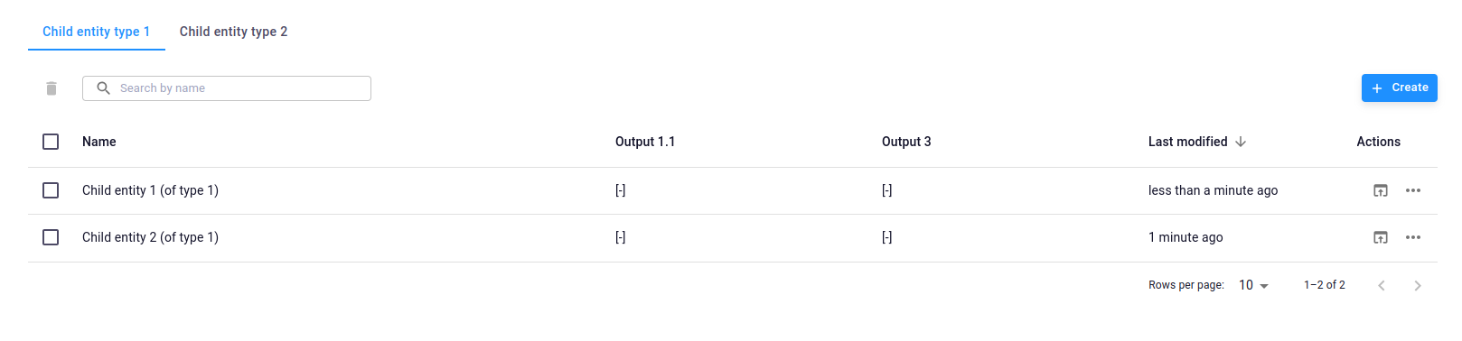
As an end user of a tree-type app, I would like to view the available children entities in a more user-friendly format than a single line, reducing the need for multiple clicks to navigate through children entity choices.
-
-
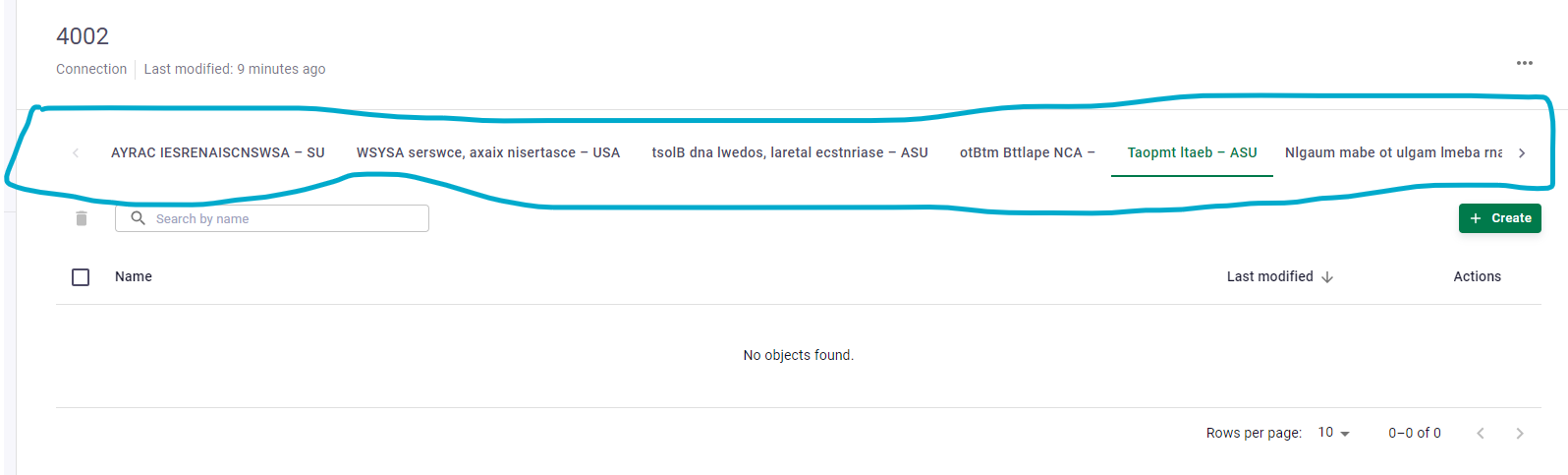
- I don’t know if “children entity” is the correct wording. May the picture help to understand. * * *
-
I think this is relevant for the VIKTOR platform because …
A tree-type app should be capable of accommodating growth in size. On our end, we anticipate having 20 to 30 children entities in the mid term (40-50 in long term) for a single Tree-type app, and these children entity names may not necessarily be short, as they need to describe correctly the content of the children entity.
Submitter proposed design (optional)
Many solutions possible :
- In my opinion, the best long-term solution is to display available children entities in a manner similar to the app page, using box-style icons. This should allow for both text and pictures, arranged in a matrix of about 4 columns per n lines.
- As a short-term quick fix, you could consider displaying children entities on multiple lines. This could be implemented as an option controlled by a boolean parameter at the tree-type app level in the code.
Current workarounds
No workaround is available. It takes many clicks to navigate to the 15th or 20th children entity. It works, although it can be quite annoying.
P.S. In case the use of the tree-type structure was challenged, we intended to store any children entities in a data structure. This was only possible by placing 20-30 children entities inside a tree-type structure instead of using an editor-type or simple-type app for that purpose.