Clearer documentation pages
Hi! Sometimes I found it hard to navigate in the documentation pages.
Relevance: I think it’s mostly relevant to new starters with Viktor platform, and non-first-time users who need to check basic things from time to time.
Proposed design
1. Visualisation of what a code section does
To provide visually an idea of what the user is going to get, and help the user to locate relevant code sections more quickly.
Take numeric-input page as example. There are subtitles, which helps, but it is in my opinion still somewhat text- and code-rich. For a beginner in coding it may help a lot to see a screenshot of “what will I get if I use this code section”, next to (or above or below) each code sections.
May be even better if that can be interactive, like dash-bootstrap-components - input.
2. A list of all available arguments, within the same page (perhaps at the end of the page)
Sometimes the user need to navigate a lot to find what they need, especially for someone who is new to the documentation. I found my patience and faith wearing down as I navigated among different sections in a page, or different pages, or each time when there is a “maybe they mean this…?” moment. That feels quite unfriendly to me. I wonder if there is anything that we can do to create a smoother experience.
Take again numeric-input page as example. Say I want to make a slider with integer inputs, with 750 - 1000 as range and 850 as default. With unfamiliarity on how the doc is organised (and with my impatience), this is what happens:
- First, I find a subtitle “Integer” in the page, and directly see
IntegerField(). → that’s great - I see no example arguments for
IntegerField(). Then, under another subtitle, I see “setting min/max” forNumberField(), and I think “maybe that’s something I can use forIntegerField()too” → not super, but good enough till this point - I still need to know how to set default value for my slider. Like what I did with the max/min, I try to find that info under other sections in the page, but don’t find it. After 1 minute I see I need to click “IntegerField”, which takes me to another page IntegerField. → getting slightly impatient
- In this new page, I see an argument ‘default’ for
IntegerField(), but no sure what’s what I need because there is not explanation. Then I see " SeeNumberFieldfor parameters". So I click the link (another link!), which takes me toNumberField. → getting worse - Under
NumberFieldI still don’t see explanation on ‘default’. So, I click another link (Ugh!!), which takes me toField. UnderFieldI finally find what I need.
New edits below
3. Easier way(s) to give feedbacks on documentation
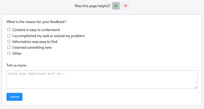
At the end of each page in the documentation the users can up- and downvote under “Was this page helpful?”, but no further comments can be submitted. For now they have to come to the community forum to give feedbacks (as “feature requests”, I assume?).
Maybe show a textbox after a user clicks up- or downvote, which they can use to submit small and page-specific feedbacks?
4. (A rather small point) in “Getting started” pages there are some Youtube videos which cannot be viewed full-screen
Watching them within the documentation page seems impractical (because everything in the videos is too small to make out). A slight inconvenience to me. A workaround is to click “watch in Youtube” and watch them in another tab.
